Époque – The Art of Travel Identity Design

Date
June 24, 2025
Category
Branding, Creative Direction, ID/Logo Design, Naming/TaglineAbout This Project
Founder/Creative Director, Tarik Koivisto, created a new luxury travel brand for client Sandra Laville, that encapsulated her expertise in bringing art and history to life through her highly engaging and educational cultural tours in France, Spain and Italy. Sandra was seeking an elegant, classic brand and logo design that incorporated history, luxury and prestige. Tarik offered three rounds of naming and logo designs to arrive at the final version.
The project began with identifying an opportunity to update the current client brand name of ‘Explore’ which was too general and commonplace, to a name that better referenced the clients’ strengths in bringing history and culture to life through her engaging European tours and rich education in art history. After multiple rounds of naming and tagline development, together with the client we finalized the new brand name to Époque. To ensure the name represented Sandra’s niche travel services and offered a clear positioning statement to her clients, we chose the tagline, The Art of Travel.
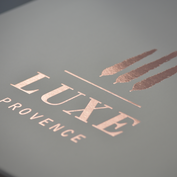
The new identity design incorporates a key historic reference, the statue of Apollo, one of Sandra’s favorite art history pieces that serves as the main brand icon and quickly symbolizes European art and culture, referencing her specialization in her tailored tour services. The typeface chosen features elements of movement, fluidity and elegance combined with a classic serif type to integrate undertones of travel. These elements were finalized with a regal frame in a bronze color scheme that referenced a historic medallion the client chose and brought the new identity design together. The logo design will be foil printed in bronze to a variety of white or dark grey thick papers for a luxury feel. “I am so happy with the final result, this is exactly what I was looking for. You nailed it right on. It is beautiful, elegant, classy and classic, hints of prestige, connotations of history and travel all in one – really, it’s perfect. Thank you, again.”
Creative Direction, Brand Strategy & Consulting, Naming, Graphic Design, Identity & Logo Design: Tarik Koivisto
Client: Époque Travel
Location: Paris, France